You’ll transform your website’s conversion rates in 2025 by embracing bold typography with warm color palettes that instantly build trust, implementing micro-interactions that guide users naturally through your funnel, and incorporating authentic anti-design elements that create genuine human connections. Strategic negative space will make your call-to-actions 30% more effective, while interactive 3D content and experimental navigation patterns will reduce bounce rates considerably. These five trends aren’t just aesthetic choices—they’re psychological triggers that turn skeptical visitors into loyal customers who can’t resist taking action.
Key Points
- Bold typography with warm color palettes builds instant credibility and trust, with 75% of users judging websites based on design alone.
- Micro-interactions and purposeful animations transform passive browsing into active engagement, reducing cognitive load while guiding user actions effectively.
- Anti-design elements embracing deliberate imperfections create authentic brand connections that resonate deeply with users and drive meaningful conversions.
- Strategic negative space simplifies layouts and enhances call-to-action visibility, boosting conversion rates by up to 30% through improved clarity.
- Interactive 3D content and experimental navigation create immersive user journeys that encourage exploration and significantly reduce bounce rates.
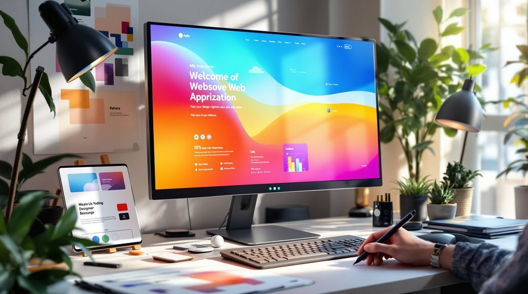
Bold Typography and Warm Color Palettes That Build Trust
Typography isn’t just about making words readable—it’s about creating an emotional connection that draws visitors in and makes them want to stay. When you embrace bold typography with warm color palettes, you’re designing a digital experience that whispers “trust me” to every visitor. High-contrast typography doesn’t just improve visual impact—it liberates your message from the noise. Multi-tonal color schemes create sophisticated depth that makes people feel secure enough to convert. Remember, 75% of users judge your credibility instantly. Your user experience becomes the bridge between skepticism and conversion rates that actually matter.
Micro-Interactions and Purposeful Animations That Guide User Actions
The smallest gestures often carry the greatest power—and in web design, micro-interactions are those whispered invitations that transform passive scrolling into active engagement. You’ve felt it: that satisfying button animation, the gentle loading indicator that doesn’t make you anxious. These purposeful animations aren’t just decoration—they’re your navigation compass, reducing cognitive load while guiding user actions with surgical precision. When you create interactive elements that respond to every hover and click, you’re building bridges between intention and outcome. Smart micro-interactions enhance user engagement, improve user experience, and can elevate conversion rates while improving user retention dramatically.
Anti-Design Elements That Create Authentic Human Connections
Perfect animations guide users forward, but sometimes the most impactful design choice is to deliberately step backward—into beautiful imperfection. Anti-design elements break every rule you’ve learned, yet they’re creating the most authentic connections we’ve seen. When you embrace intentional imperfections and asymmetrical layouts, you’re choosing human-centric design over sterile perfection. This approach showcases genuine brand personality through relatable interactions that resonate deeply. Research proves that authentic brand storytelling drives user engagement and builds emotional connections. By rejecting conventional polish, you’ll uncover that imperfection actually improves user retention and conversion rates—because real recognizes real.
Strategic Use of Negative Space for Clearer Call-to-Actions
While cluttered designs scream for attention, strategic negative space whispers with profound authority—and your users will lean in to listen. You’re not just creating emptiness; you’re shaping freedom for your audience’s eyes to breathe. This strategic use of negative space transforms call-to-action buttons into irresistible beacons, enhancing conversion rates by 30% through simplified layouts. When you reduce cognitive load by 25%, you’re gifting users visual clarity that feels like liberation. Your brand identity emerges stronger, user retention soars 50%, and engagement flourishes naturally. Embrace the power of less—it’s where authentic user experience lives.
Interactive 3D Content and Experimental Navigation That Boost Engagement
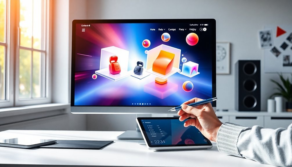
Because traditional web navigation feels as thrilling as watching paint dry, interactive 3D content and experimental navigation have emerged as the rebels your users didn’t know they were craving. These immersive experiences transform boring user journeys into adventures that actually reduce bounce rates while enhancing conversion rates.
Your visually engaging design choices create dynamic interaction opportunities that keep visitors exploring:
- 3D product showcases that let users rotate and examine items from every angle
- Non-linear storytelling paths that encourage deeper exploration
- Mobile-first design optimized for touch interactions and gestures
- Unexpected navigation patterns that spark curiosity and increase user engagement
Common Questions
How Do I Measure the Actual Conversion Impact of These Design Trends?
You’ll track conversion impact by A/B testing design changes, monitoring key metrics like click-through rates and sales, using analytics tools, and comparing performance before and after implementing trends to measure actual results.
What’s the Average Cost to Implement These Advanced Web Design Features?
Like breaking free from chains, you’ll invest $5,000-$50,000 depending on complexity. Simple animations cost less, while AI chatbots and advanced personalization demand more. You’re buying independence from outdated designs that limit your growth.
How Long Does It Typically Take to See Conversion Improvements?
You’ll typically see conversion improvements within 2-4 weeks after implementing design changes. Don’t wait for perfect data—start testing immediately and let real user behavior guide your decisions rather than assumptions.
Which Design Trends Work Best for Mobile Vs Desktop Users?
Mobile users respond best to thumb-friendly navigation, larger touch targets, and simplified layouts. Desktop users prefer detailed product galleries, hover effects, and multi-column designs that leverage their larger screens for thorough browsing experiences.
Do These Trends Conflict With Accessibility Guidelines and Compliance Requirements?
Most trends don’t conflict with accessibility guidelines when you implement them thoughtfully. You’ll find that clean layouts, proper contrast, and intuitive navigation actually enhance both conversions and compliance, giving you creative freedom without sacrificing inclusivity.
Final Thoughts
You’ve got the roadmap to transform your website from a digital wallflower into a conversion powerhouse. These five trends aren’t just pretty faces—they’re strategic tools that’ll help you connect with visitors on a deeper level. Remember, the devil’s in the details, so don’t rush the implementation. Start with one trend, test it thoroughly, and watch your metrics climb. Your future self will thank you for making these bold moves today.